Adding Theme Customization to My Tutor Board React App
Adding Theme Customization to My Tutor Board React App
Impetus
I’ve been bored staring at the same UI interface for TutorBoard for ages. I think its time for a fresh coat of paint.
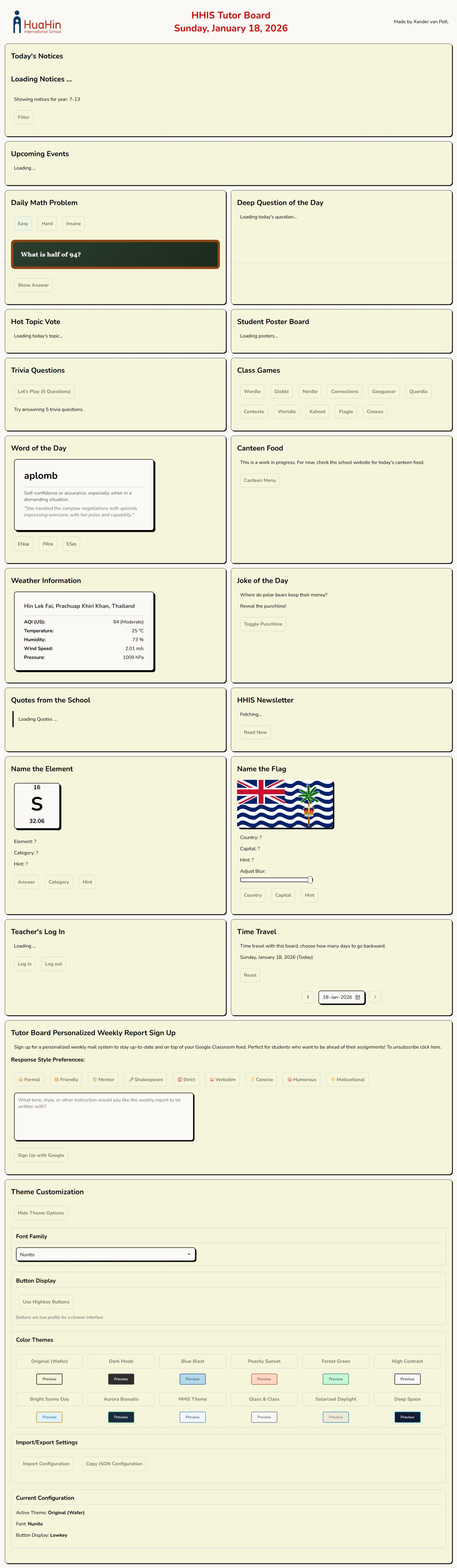
In the past, I’ve copy and pasted in and out different css files (yes I don’t use tailwind) to adjust the theme. I quite liked this paper look:
But I wished there was a way for the each class to pick their own favorite theme to make it feel more customized. I decided to bring this a step further by making the students / teachers able to write their own JSON format style descriptor:
Here’s how I did it, and how I you can too. It’s generalizable across React apps.
Step 1: CSS Variables Are Magical
The entire theme system hinges on one beautifully simple concept: CSS Custom Properties (a.k.a CSS variables). Instead of hardcoding colors throughout your stylesheets, you define them once at the :root level and reference them everywhere, like so (the actual root CSS variables that Tutor Board uses):
:root {
  --primary-bg: #faf9f5;
  --secondary-bg: beige;
  --text-primary: black;
  --text-secondary: #666;
  --text-tertiary: #555;
  --text-quaternary: #777;
  --text-disabled: #a5a5af;
  --text-dark: #333;
  --text-darker: #333333;
  --text-light: #999;
  --button-bg: #faf9f5;
  --button-border: black;
  --button-shadow: black;
  --button-disabled-bg: #a5a5af;
  --button-disabled-border: grey;
  --border-primary: black;
  --border-secondary: #ddd;
  --border-disabled: grey;
  --shadow-primary: rgba(0, 0, 0, 0.3);
  --shadow-light: rgba(0, 0, 0, 0.5);
  --accent-color: #d90000;
  --special-glow: #c0c0c0;
  --success-color: #94ff94;
  --success-text: green;
  --error-color: #ffadad;
  --error-text: red;
  --warning-bg: #fff3e0;
  --warning-light: #ffebee;
  --neutral-light: #e8e8e8;
  --neutral-success: #e8f5e8;
  --info-bg: #e8f4f8;
  --info-border: #4a90a4;
  --info-text: #2c5f72;
  --white: #ffffff;
  --white-secondary: #f8f8f8;
  --white-tertiary: #e8e8e8;
  --white-quaternary: #f0f8ff;
  --white-quinary: #f5f5f5;
  --scrollbar-thumb: #c2c2c2;
  --scrollbar-thumb-hover: #929292;
  --toast-close: rgba(0, 0, 0, 0.5);
  --toast-close-hover: rgba(0, 0, 0, 0.8);
  --input-invalid: #ffadad;
  --blackboard-bg: linear-gradient(135deg, #2c3e2d 0%, #1a2b1d 100%);
  --blackboard-border: #8B4513;
  --blackboard-border-dark: #654321;
  --chalk-text: #f0f0f0;
  --chalk-answer: #90EE90;
  --chalk-highlight: #FFD700;
  --pedestal-bg: linear-gradient(135deg, #ffffff 0%, #f8f8f8 50%, #e8e8e8 100%);
  --pedestal-border: #d4d4aa;
  --pedestal-border-dark: #c9c9a0;
  --pedestal-text: #2c2c2c;
  --pedestal-highlight: #8B4513;
  --font-family: 'Nunito', Tahoma, Geneva, Verdana, sans-serif;
}
The magic comes when you change a CSS variable’s value, every single element using that variable updates instantly. no complex react props or context API headaches. Fast, pure, immediate visual feedback.
The you can API with the current CSS and alter the variables super easily:
export const applyTheme = (theme) => {
  const root = document.documentElement;
  if (theme.primaryBg) root.style.setProperty('--primary-bg', theme.primaryBg);
  if (theme.textPrimary) root.style.setProperty('--text-primary', theme.textPrimary);
  // ...repeat for all your design tokens
};
Meanwhile, in your CSS, you’d just do:
.theme-section h3 {
  border-bottom: 2px solid var(--border-secondary);
}

.theme-btn {
  background: var(--accent-color);
  color: var(--white);
}
That’s all there is to it. Call applyTheme() with a new theme object, and the entire UI transforms in real-time.
You’d want to keep all this logic in a react object that sits near the root of the HTML structure.
Structuring Themes: The JavaScript Object Approach
I store all my themes as plain JavaScript objects in a ThemeSelector.jsx. Each theme is essentially a big dictionary mapping design token names to values:
const themes = {
    original: {
        name: "Original",
        primaryBg: "#f0f5ff",
        secondaryBg: "#dbeafe",
        textPrimary: "#111827",
        textSecondary: "#374151",
        buttonBg: "#ECECEC",
        // ...like 20-30 more properties
    },
    darkMode: { /* ... */ },
    paperLook: { /* ... */ }.
    // ...styles continue down here
}
Every theme has the exact same property names - primaryBg, textPrimary, buttonBg, etc., making them completely interchangeable. You can swap between themes without worrying about missing properties or undefined styles. Standardization!
The User Experience Side
When a user clicks a theme button to a theme their eye desires, I run:
const handleThemeChange = (themeKey) => {
  setCurrentThemeKey(themeKey);
  const themeData = themes[themeKey];
  applyTheme(themeData);
  saveThemeToLocalStorage(themeKey, themeData);
};
- Update React state (for UI consistency)
- Apply the theme (instant visual change via CSS variables)
- Save to localStorage (so it persists across sessions)
The and as the browser renders in real-time, there’s no re-render, lag or loading. It is basically instantaneous. Makes you admire the browser.
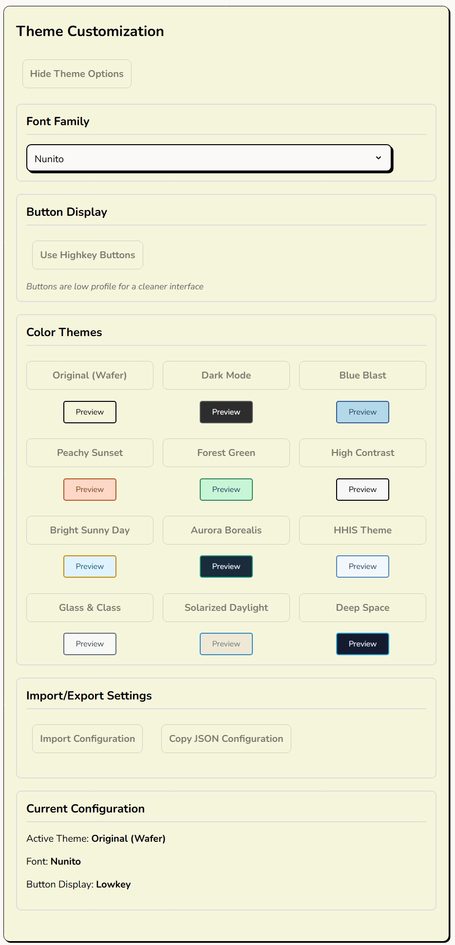
Extra Flavour: Custom JSON Themes!
This is where it gets fun. Instead of being limited to predefined themes, users can paste in their own JSON configuration. They can go as minimal or as comprehensive as they want:
{
  "primaryBg": "#1a1a2e",
  "accentColor": "#ff6b6b"
}
I made my system intelligently merge their custom values with the current theme:
const mergeThemeWithCurrent = (customTheme) => {
  const currentTheme = themes[currentThemeKey] || themes['original'];
  return { ...currentTheme, ...customTheme };
}
So if someone only wants to change two colors? Cool, everything else stays the same. Want to define every single property? Also cool, total control is theirs.
Import/Export: Sharing is Caring
Users can export their entire configuration as JSON - theme, font choices, button styles, everything:
{
  "theme": {
    "primaryBg": "#f0f5ff",
    "secondaryBg": "#dbeafe",
    // ...all tokens
  },
  "fontFamily": "nunito",
  "discreetButtons": false
}
Copy that JSON, share it with your class group chat, and everyone can have the exact same aesthetic. Or mix and match. You could take someone’s colors but keep your own fonts.
Persistence: LocalStorage to the Rescue
Nobody wants to reconfigure their theme every time they reload the page. I use simple localStorage utilities to save and restore configurations:
saveThemeToLocalStorage(themeKey, themeData);
// On app load:
const savedTheme = loadThemeFromLocalStorage();
if (savedTheme) applyTheme(savedTheme);
It’s basic but it works perfectly. Your theme choices persist across sessions, across different browsers if you’re logged in, across the heat death of the universe (or until you clear your cache, whichever comes first).
Live Preview: See Before You Commit
Before committing to a theme, users get a live preview panel that uses the theme’s own colors to style itself. It’s like paint swatches, for the UI themes:
const getThemePreview = (theme) => {
  return (
    <div style={{
      background: theme.primaryBg,
      color: theme.textPrimary,
      border: `2px solid ${theme.borderSecondary}`
    }}>
      {/* Preview content */}
    </div>
  );
};
Result:
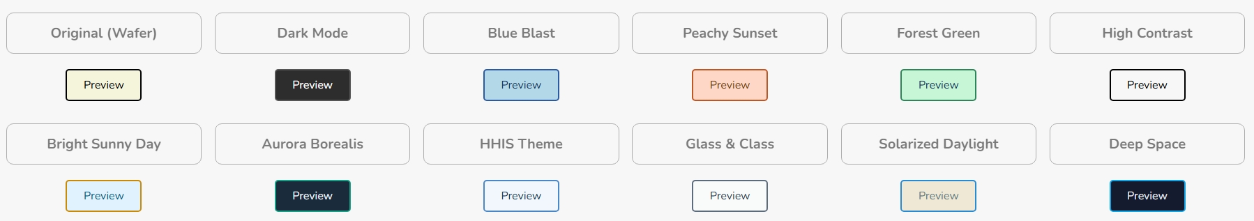
Simple but effective. You can hover over themes and immediately see how they’ll look without actually switching.
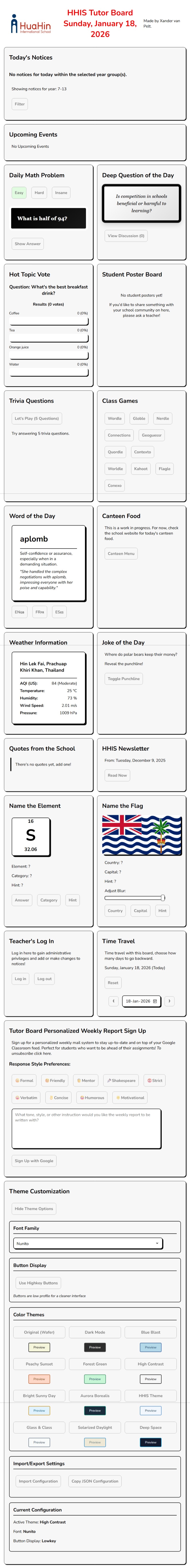
Challenges and Solutions
The “Missing Property” Problem: Early on, if a custom theme was missing properties, things would break or look weird. Solution? The merge function always uses a complete theme as the base, so missing properties automatically fall back to sensible defaults.
JSON Parsing Errors: Users paste invalid JSON sometimes (we’re all human). I wrapped the parser in a try-catch and show a friendly error message instead of letting the app crash. Basic defensive programming, but essential for UX.
Performance Concerns: I was initially worried about calling applyTheme() being expensive with 30+ CSS variable updates. Turns out? Not even close to a problem. CSS variable updates are incredibly performant, and the whole operation completes in single-digit milliseconds.
Farewells
This theme system took maybe 3-4 hours to build from scratch, and it’s been one of the highest ROI features I’ve added to Tutor Board. Teachers love being able to customize their classroom’s look, students think it’s cool that they can design their own themes, and I love that the implementation is clean, extensible, and requires zero external dependencies.
If you’re building any kind of user-facing application, seriously consider adding theme customization. It’s way easier than you think, and users absolutely love having control over their visual environment. It’s also a great excuse to play with color palettes for a few hours under the guise of “important development work.”
‘Till the next one…